That Chart Showing AI Can Do 80% of Your Job? I Read the Fine Print.
That chart showing AI can do 80% of your job? I read the fine print.
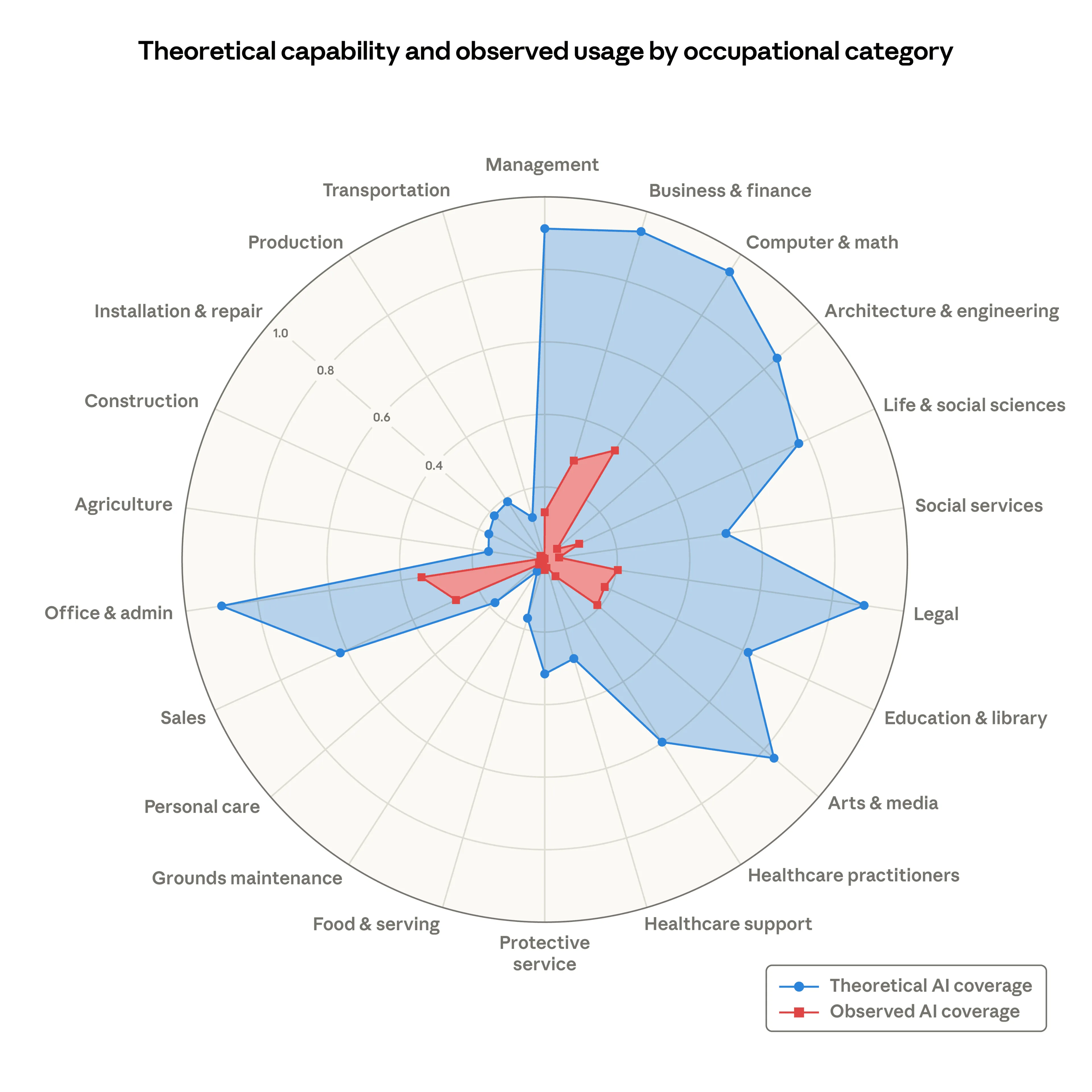
The scary graphic from Anthropic has been everywhere this week. Big blue bars showing AI's "theoretical capability" across 22 job categories. It looks terrifying.
Here's what the chart doesn't tell you:
Those numbers come from a single 2023 study (co-authored by OpenAI, by the way). The people who labeled which jobs AI could replace were "mostly unaware of the specific occupations" they were evaluating. They set no timeline for when any of this would happen. And "theoretical capability" included technology that doesn't exist yet.
Strip out the speculation and the actual number drops from 80% to 15%.
But here's the part that should really make you pause: Anthropic's own current employment data shows no measurable difference in unemployment between AI-exposed jobs and non-exposed jobs. The company that published the scary chart has data that contradicts it.
I've spent the last two days talking about real AI risks (supply chain fragility, tools disappearing overnight). Those are worth planning for. A chart built on three-year-old guesses by people who don't do the jobs they evaluated? That's not a reason to freeze your hiring or panic about your business model.
AI is a tool. Treat it like one. Don't let someone else's speculation drive your strategy.